
ML Interview Q Series: ROC Curves & AUC: Robust Evaluation for Binary Classifiers Under Class Imbalance.

📚 Browse the full ML Interview series here.
ROC Curve and AUC: What is a ROC curve and what does the Area Under the Curve (AUC) signify? *Explain how the ROC curve is constructed by varying the classification threshold, why AUC is useful for comparing classifiers (especially under class imbalance), and how AUC differs from accuracy as an evaluation metric.*
Understanding Receiver Operating Characteristic (ROC) curves and the Area Under the Curve (AUC) is crucial for evaluating binary classification performance. They offer a perspective that differs from accuracy, particularly in settings with class imbalance or differing misclassification costs. Below is a detailed discussion of how ROC curves are constructed, why AUC is a robust metric, and how these differ from using accuracy.
Building Intuition around ROC Curves A ROC curve demonstrates how a classifier’s True Positive Rate (TPR) varies against its False Positive Rate (FPR) across different probability thresholds. Imagine a binary classifier that assigns a probability to each sample indicating how likely it is to be positive. If you choose a high threshold, you will label fewer samples as positive, likely reducing false positives but also increasing false negatives. Conversely, lowering the threshold will allow more samples to be labeled as positive, often increasing true positives while also increasing false positives.
To construct a ROC curve:
Sort the samples by their predicted probabilities.
Vary the threshold from the highest predicted probability to the lowest.
At each threshold, compute TPR (the fraction of actual positives correctly classified) and FPR (the fraction of actual negatives incorrectly classified as positive).
Plot these (FPR on the x-axis, TPR on the y-axis) to visualize the trade-off between correctly identifying positive samples and incorrectly flagging negative samples.
Mathematically, for a given threshold:

where TP, TN, FP, and FN stand for true positives, true negatives, false positives, and false negatives, respectively. A point on the ROC curve corresponds to a particular (TPR, FPR) pair obtained at a specific threshold.
Significance of the AUC (Area Under the Curve) The area under this ROC curve, often called AUC, measures how well the classifier distinguishes between positive and negative samples over all possible thresholds. Intuitively, the AUC can be interpreted as the probability that the classifier will rank a randomly chosen positive sample higher (in terms of predicted probability) than a randomly chosen negative sample. A perfect classifier has an AUC of 1.0, indicating it assigns a higher score to every positive sample than to any negative sample, while a purely random classifier has an AUC of 0.5.
Benefits of Using AUC under Class Imbalance A key advantage of AUC is that it is less sensitive to class imbalance than metrics like accuracy. Accuracy can become misleading if one class heavily dominates the dataset. If most samples belong to the negative class, a naive classifier that always predicts “negative” could achieve a high accuracy. The ROC curve, however, looks at both TPR and FPR over many thresholds, reflecting the inherent ranking quality of the classifier rather than its raw correctness ratio. This makes AUC especially useful when positive samples are rare or when there is a large skew in class distribution.
How AUC Differs from Accuracy Accuracy is straightforward: it is the fraction of correctly classified samples out of all samples. It depends on a fixed decision threshold (often 0.5 for binary classification), which may not reflect the optimal trade-off in certain applications. On the other hand, the ROC curve aggregates performance across every possible threshold into a single curve, and the AUC summarizes the “aggregate” performance in one number.
Accuracy answers: “Out of all predictions, how many did we get right with a certain threshold?” AUC answers: “Over all possible decision thresholds, how well can we order examples so that positives rank higher than negatives, regardless of how many positives vs. negatives we have?”
This distinction is crucial in real-world scenarios, especially when misclassifications have different costs or when an application calls for controlling FPR or TPR independently of a single threshold.
Practical Example in Python
import numpy as np
from sklearn.metrics import roc_curve, roc_auc_score
import matplotlib.pyplot as plt

# Example: Suppose we have ground-truth labels and predicted probabilities
y_true = np.array([0, 0, 1, 1, 0, 1, 0, 0, 1, 1])
y_scores = np.array([0.1, 0.4, 0.35, 0.8, 0.2, 0.7, 0.05, 0.5, 0.9, 0.6])

# Compute false positive rate (fpr), true positive rate (tpr) for ROC
fpr, tpr, thresholds = roc_curve(y_true, y_scores)

# Calculate AUC
auc_value = roc_auc_score(y_true, y_scores)

print("FPR:", fpr)
print("TPR:", tpr)
print("Thresholds:", thresholds)
print("AUC:", auc_value)

# Plot the ROC curve
plt.plot(fpr, tpr, label=f'ROC curve (AUC = {auc_value:.2f})')
plt.plot([0, 1], [0, 1], linestyle='--', color='r', label='Random Classifier')
plt.xlabel('False Positive Rate')
plt.ylabel('True Positive Rate')
plt.title('ROC Curve Example')
plt.legend()
plt.show()
In this code snippet:
We have
y_trueas the actual labels (0 or 1).We have
y_scoresas the predicted probabilities from some classifier.We extract the FPR and TPR across all unique thresholds.
We compute and print the AUC, then visualize the ROC curve.
Heading and Sub-Heading for Further In-Depth Exploration
How ROC Curves Handle Different Thresholds One strength of ROC curves is they reveal how classification performance changes as you alter the decision threshold. In certain practical tasks, you might choose a very low threshold if missing even a single positive (for instance, a fraudulent transaction) is worse than having many false alarms. By studying the ROC curve, you can see exactly how TPR and FPR change in tandem.
Behavior of AUC Values
An AUC of 1.0 means the predictions perfectly separate positives and negatives across all thresholds.
An AUC of 0.5 means no better than random guessing.
An AUC close to 1.0 indicates a strong capacity to rank-order the classes.
The Tie to Ranking A more theoretical perspective is that the AUC measures the quality of ranking. If you randomly pick one positive and one negative, the probability that the positive scores higher than the negative is precisely the AUC, assuming no ties.
Impact of Extreme Class Skews For extremely imbalanced data, even ROC curves can become overly optimistic. In such cases, Precision-Recall curves often provide additional insight, because Precision is more sensitive to the proportion of false positives. However, AUC still remains more robust than simple accuracy when the dataset is unbalanced.
What if the ROC Curve is Always Near the Diagonal?
If your ROC curve is close to the diagonal line from (0,0) to (1,1), it suggests your model performance is close to random guessing. This can mean your features or the model design are inadequate to capture meaningful patterns. You would want to explore feature engineering, data collection strategies, or different model architectures.
One subtlety is that if you see a curve below the diagonal, it often means your model is “inversely” predicting well. Simply reversing the decision (e.g., flipping positive to negative) might yield performance above the diagonal. This can happen if a model has learned some anti-pattern or if the labeling is reversed in certain segments of the data.
How Does AUC Compare When Two ROC Curves Cross Each Other?
If two ROC curves cross, it can happen that one model outperforms the other at some thresholds, while the other model is better at different thresholds. The AUC is a single value summarizing the overall performance. If one classifier has a higher AUC, on average it has a better ability to rank positives over negatives, though at specific thresholds another classifier might still perform better. In practice, you often look at both the ROC curves and the numerical AUC.
Why Might Accuracy be Inappropriate for Skewed Data?
Accuracy is computed as:

When negatives vastly outnumber positives, a classifier can do extremely well by predicting most things as negative, leading to a large TN count and misleadingly high accuracy. This does not help if the goal is to identify rare positive instances (like fraud detection, rare disease detection, or other high-impact but infrequent events). The ROC curve and the AUC measure how well the model can separate classes, rather than focusing on a fixed threshold. Therefore, they remain more meaningful measures in such scenarios.
Potential Pitfalls with AUC
It does not penalize large false positives in very imbalanced settings as heavily as Precision-Recall-based metrics do. If your positive class is extremely rare and false positives are expensive, you might want to look at Precision-Recall curves in addition.
A very high AUC does not necessarily translate to optimal performance at a specific threshold. You still need to pick a threshold that aligns with your business or application objectives.
Follow-up Question: “How do I Choose the Best Threshold from the ROC Curve in Practice?”
Often, people use the point on the ROC curve closest to the top-left corner (0,FPR=0) as a heuristic for the “best” trade-off. Alternatively, you might optimize for some metric like Youden’s J statistic, which is:
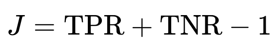
where TNR is

. That threshold maximizes TPR + TNR. In practice, the best threshold can also depend on real-world costs of false positives vs. false negatives. If false negatives are extremely costly (missing a cancer diagnosis), you might push toward higher TPR at the expense of a higher FPR.
Follow-up Question: “Are ROC Curves Always the Right Choice for Imbalanced Data?”
While ROC curves are still informative, many practitioners use Precision-Recall (PR) curves in severely imbalanced contexts. This is because Precision focuses on the fraction of positively predicted samples that are actually correct, which becomes very important when positives are rare. The ROC curve might still show a high TPR and deceptively low FPR if the true negative count is extremely large. Meanwhile, a PR curve can demonstrate that only a small fraction of predicted positives are truly positive, alerting you to a potential problem if false positives are costly.
Follow-up Question: “Why Compare AUC Instead of Directly Comparing ROC Curves?”
Comparing entire ROC curves visually is sometimes subjective, especially if two curves intersect. A single numerical value like the AUC provides a more straightforward comparison. It can still be valuable to show the full ROC plot to understand threshold-dependent nuances. But in practical terms, when you have to pick a model quickly, the AUC is a concise summary of ranking performance.
Follow-up Question: “What if My Model Outputs are Not Probabilities but Hard Class Labels?”
A ROC curve requires a ranking or continuous score. If you only have discrete 0/1 predictions, you cannot generate a ROC curve that shows behavior at varying thresholds. In this case, you would need the underlying logistic or probabilistic outputs from the model. If it is truly only providing a binary label, you might look at metrics like accuracy, precision, recall, or the F1-score at that single operating point. However, many modern classifiers can be configured to output probabilities or decision scores, making ROC analysis possible.
Follow-up Question: “Can We Use AUC for Multi-Class Classification?”
For multi-class problems, the concept of an ROC curve extends by binarizing each class (one-vs-rest) and computing an AUC for each class separately, then averaging. Alternatively, you can do pairwise comparisons of each class vs. each other class (one-vs-one) and average. However, the interpretation becomes more complex, and metrics such as the macro-average or micro-average might be needed. The principle remains similar: measure how well your model’s decision rules separate one class from the others across different thresholds.
Follow-up Question: “What if My ROC Curve is Extremely ‘Jagged’? Is That a Problem?”
A “jagged” ROC curve often indicates that your dataset or the predicted scores are limited in resolution (small dataset or many tied scores). This might happen if the model outputs probabilities with minimal granularity (for instance, rounding to 1 decimal place). In large datasets or with more precise probability estimates, the ROC curve becomes smoother. The shape does not necessarily imply poor performance; it primarily reflects discrete jumps in threshold changes due to tied probabilities.
Follow-up Question: “If I Have a Certain Operating Point in Mind, Should I Rely Solely on AUC?”
Relying solely on AUC might not suffice if you know your final application demands a certain TPR or FPR. If your main priority is keeping FPR below a specific threshold, you should examine the ROC curve directly for the region of interest. The AUC might be high, yet the performance in the narrow FPR region you care about could be suboptimal. Hence, always consider both the curve and the numeric summary in decision-making.
Follow-up Question: “What Extra Precautions Should We Take for Real-World Deployment?”
Collect representative data reflecting the expected distribution. If your data distribution shifts in production, your AUC and ROC curve might not hold.
Continuously monitor how the operating threshold should change if the ratio of positives to negatives evolves over time.
Evaluate other metrics that may be more closely aligned with your business objectives—cost-sensitive metrics or domain-specific metrics can be critical.
Below are additional follow-up questions
How do we interpret partial AUC, and when might partial AUC be more relevant than the standard AUC?
Partial AUC focuses on a specific region of the ROC curve, often where the False Positive Rate (FPR) is below a certain threshold. This can be more relevant than the overall AUC in scenarios where practitioners only care about performance in a limited range of the FPR or TPR—for example, if a medical screening test is only practical when its FPR stays under 5%. By concentrating on a portion of the curve, partial AUC allows you to see how well the model distinguishes positives from negatives precisely in the region that matters most.
A common pitfall is that partial AUC might appear favorable because you are ignoring how the model behaves in other regions. If you artificially restrict your analysis to a narrow portion, you could miss the fact that the classifier may perform poorly outside that region. Also, comparing partial AUC values from two models can be tricky if they cross each other’s ROC curves outside the region of interest. Careful domain knowledge is necessary to identify which subrange of FPR or TPR is critical. This approach is especially useful in real-world applications where there is a strict upper limit on the tolerated FPR (e.g., a security system that cannot afford many false alarms).
How can we compute the statistical significance or confidence intervals for the difference in AUC between two classifiers?
Statistical significance testing for AUC can be approached via methods like bootstrapping. In a bootstrapping procedure, you resample (with replacement) from your dataset many times to produce multiple estimates of each model’s AUC. By comparing these distributions, you can form confidence intervals (often 95%) around each classifier’s AUC and perform a paired test (because both models use the same underlying dataset). If the confidence intervals barely overlap or do not overlap at all, you can say with some confidence that one classifier outperforms the other.
A pitfall is to assume that a small numerical difference in AUC always indicates a real performance gap. With limited data, the variance in AUC estimates can be high. If you see 0.78 vs. 0.80 for two models, that difference might not be significant unless you have enough samples or unless bootstrapping clearly confirms the difference. Also, be wary of overfitting if you tune hyperparameters on the same data used to compute AUC; you might get an overly optimistic estimate of significance.
What if the dataset has label noise? How does label noise affect the shape of the ROC curve and the reliability of the AUC?
Label noise—where positive samples are sometimes mislabeled as negative, or vice versa—generally degrades the apparent performance of any classifier. The ROC curve can become less distinct because even a perfect model might misclassify “noisy” points whose labels are flipped. This tends to pull the curve downward (reducing TPR) or to the right (increasing FPR), lowering the AUC.
One subtle effect is that heavy label noise in the positive class can lead to an inflated false negative count, potentially creating misleading dips in the ROC curve. Similarly, noise in the negative class inflates false positives. To mitigate these problems:
Clean or relabel suspicious samples if possible.
Use robust training strategies, such as noise-robust loss functions or data augmentation.
Collect additional data to statistically reduce the impact of mislabeled examples.
In real-world systems, label noise is rarely uniform; certain subgroups or edge cases might be more prone to mislabeling. This uneven noise distribution can result in localized distortions of the ROC curve. As always, domain expertise helps diagnose whether performance issues stem from label noise or genuine model shortcomings.
Is it ever acceptable for a segment of the ROC curve to slope downward? Why might that happen?
A properly plotted ROC curve typically moves monotonically from the bottom-left (FPR=0, TPR=0) to the top-right (FPR=1, TPR=1). However, you might see a “downward” step or loop if the classifier produces identical scores for different samples that have different true labels. This can happen when:
The model clusters many positives and negatives at the same probability score, leading to a big jump in both TPR and FPR simultaneously. In certain plots, it can manifest as visually stepping backwards.
There are very few unique score values (for example, if the classifier outputs only a handful of discrete probabilities).
Though often it is considered a quirk of discrete scoring or a small dataset, a slightly downward segment is not necessarily a fundamental error. It can, however, indicate that your model might not be sufficiently distinguishing certain samples. From an operational standpoint, if these backward segments are large, your classifier’s performance is erratic in that threshold range. A typical fix is to ensure your model outputs continuous probabilities—like from a well-calibrated logistic output—so that you get a smoother curve.
How might the base rate (class distribution) in the test set differ from real-world usage, and how does that affect interpreting AUC?
If the proportion of positives and negatives in your test data does not match the real-world distribution, it can affect how you interpret the model’s apparent quality. While the ROC curve (and AUC) are fairly robust to changes in class distribution, extreme mismatches could still lead to misleading impressions, especially if the mismatch highlights different parts of the score distribution. For instance, in the real world, positives might be extremely rare, but your test set might have been artificially balanced (50-50). That balanced test might produce a flattering AUC that fails to reveal how the model behaves when negatives vastly outnumber positives.
To handle this:
Try to keep your test distribution representative of real-world conditions.
Consider analyzing additional metrics like Precision-Recall curves. Precision, especially, is sensitive to the base rate of positives.
In some fields, you can do post-hoc threshold tuning by looking at how well the model calibrates for different base rates.
How do we handle cost-sensitive classification if we primarily rely on AUC and ROC curves?
ROC curves and AUC measure how well a model ranks positives above negatives irrespective of the specific costs of false positives vs. false negatives. In high-stakes applications—like fraud detection, medical diagnosis, or spam filtering—these misclassification costs can differ dramatically. If a false positive is very expensive (e.g., investigating a legitimate transaction as if it were fraud), you might want to ensure a very low FPR even if that lowers TPR.
To incorporate cost considerations more formally, one might:
Use a cost matrix or custom loss function during training to penalize certain mistakes more heavily.
Modify the threshold choice to minimize overall expected cost rather than just optimizing TPR/FPR trade-offs.
Evaluate other metrics, such as cost-weighted accuracy or the Weighted Error Rate, that incorporate cost or domain-specific utility.
A common pitfall is to rely solely on the AUC ranking. You might end up selecting a model with a slightly better overall ranking ability but a worse cost ratio at the threshold you actually use in practice. Being mindful of domain-specific cost constraints is critical.
Might we want to sample or bin the negative class differently to produce a more interpretable ROC curve when data is extremely imbalanced?
In highly skewed datasets, the negative class can dominate, making it difficult to see changes in the FPR for small threshold adjustments. Some practitioners create a “stratified” or “rebalanced” test set by undersampling negatives so that variations in FPR are more visible in the ROC curve. This can help you better see performance differences among thresholds. However, you must be careful when interpreting the resulting curve: the artificially balanced sample no longer matches the real-world prevalence of negatives.
A second approach is to sample the negative class in a controlled manner—like fractionally or proportionally—and then extrapolate performance metrics back to the real distribution. This extrapolation can be mathematically correct if done carefully, but is prone to error if you do not preserve the underlying score distribution or if certain subtypes of negatives are underrepresented. Always note how you sampled and how that might affect real-world inferences.
In what ways can the magnitude of predicted probabilities matter beyond just their ranking for the ROC curve?
The ROC curve and its AUC primarily evaluate the rank ordering of predicted scores—whether positives tend to get higher scores than negatives. However, the raw probabilities themselves are crucial for:
Calibrating models: Even if the ranking is good, the absolute predicted probabilities might be miscalibrated (e.g., the model outputs 0.9 for many samples that are only correct half the time).
Decision-making under uncertainty: If you want to intervene based on a risk threshold (like hospital admissions or resource allocation), you might need accurate probabilities, not just a good ranking.
Expected cost or utility calculations: Many cost-sensitive frameworks depend on correct estimates of probability, not just the model’s ability to differentiate positives from negatives.
A pitfall arises if you rely solely on the ROC curve. You might choose a model that ranks positives fairly well but is systematically overconfident or underconfident in its scores. This discrepancy can lead to real-world decisions that are misaligned with actual risks. Calibration techniques—like Platt scaling or isotonic regression—can be used to tune the model’s predicted probabilities for better real-world applicability, even if the ranking was already acceptable from a ROC standpoint.